SPEND MANAGEMENT | B2B FINTECH
One Moment, Two Users
Redesigning B2B spend management for mid-market SaaS teams, where employee speed and finance happen in the same interaction, not as a trade off.
SPEND MANAGEMENT | B2B FINTECH
Redesigning B2B spend management for mid-market SaaS teams, where employee speed and finance happen in the same interaction, not as a trade off.
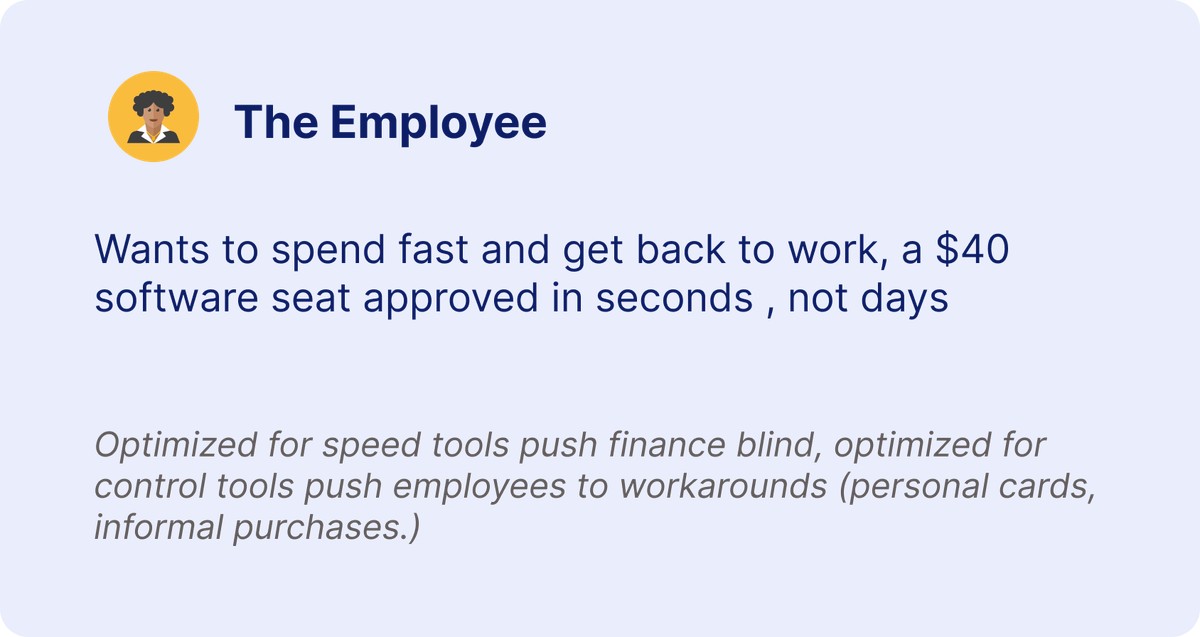
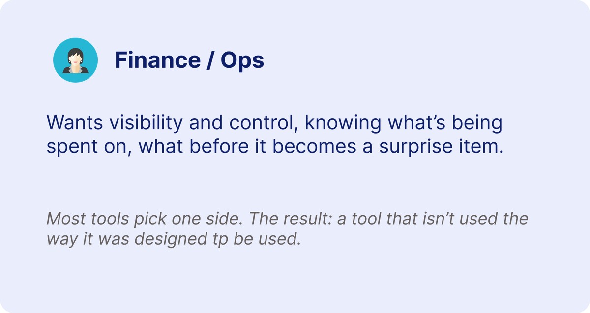
Problem: B2B spend tools force a tradeoff, employee speed or finance control, and concentrate that control into a single moment, either before the purchase or after it.
Approach: Secondary and competitive research (no live user base) into mid-market SaaS spend tools, defining a purchase-to-resolution flow where both needs happen in the same interaction.
Outcome: A single-moment design, purchase, tiering, intervention, resolution, with the validation metrics defined upfront, ready to test.
THE PROBLEM
HOW MIGHT WE
Scoped to mid-market tech/SaaS companies (100 to 1,000 employees), where decentralized buying meets formalizing finance work.
RESEARCH APPROACH
A deliberate methodology choice: finance/ops professionals are unusually vocal in public about this exact pain point.
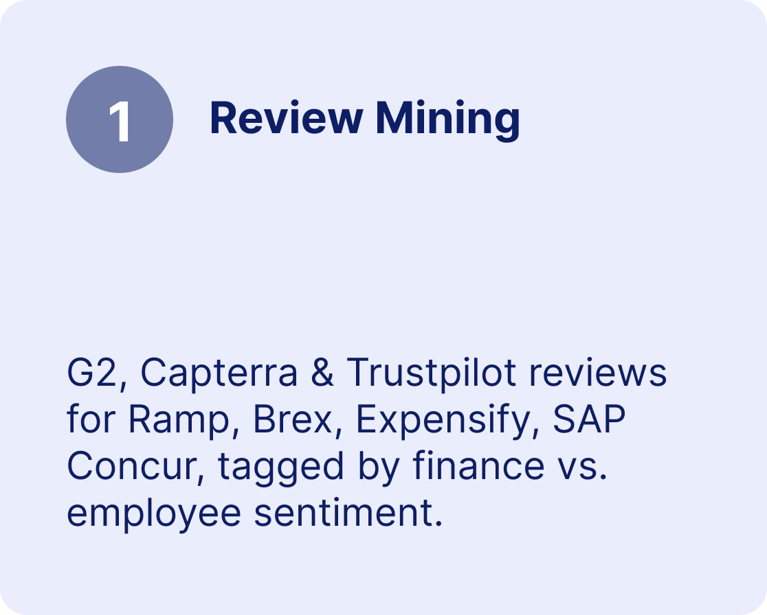
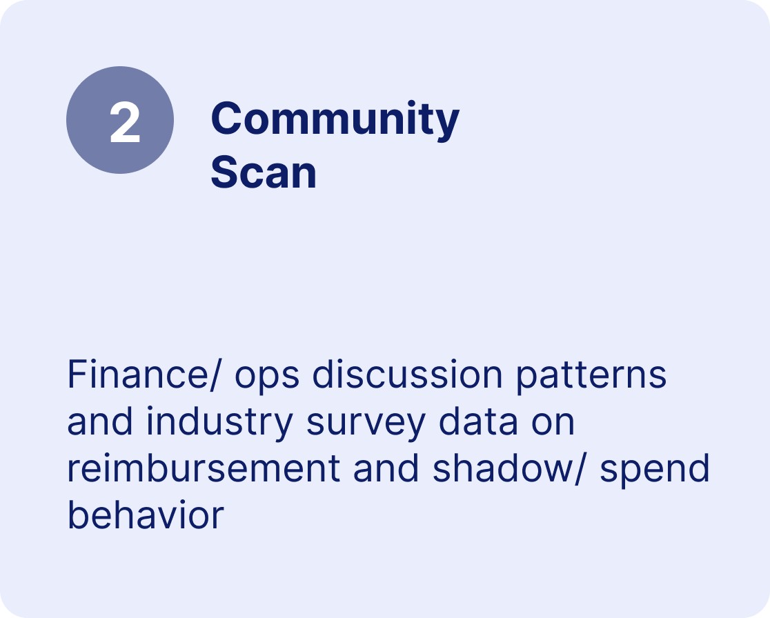
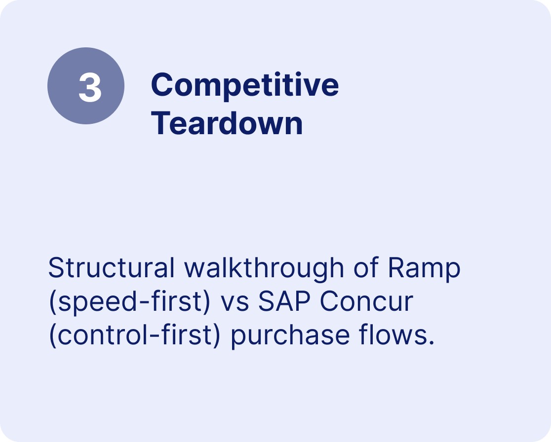
A production version would follow with moderated interviews to validate the specific solution. This study validates the problem space.
WHAT THE EVIDENCE SHOWS
291
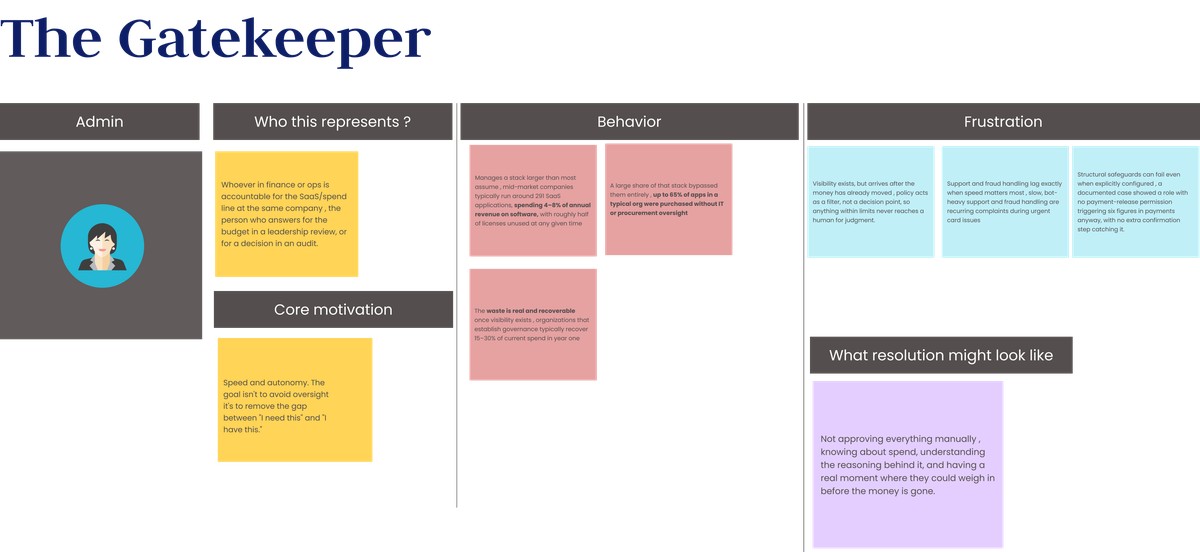
SaaS apps run by the average mid-market company
65%
purchased without IT or procurement oversight
~50%
of licenses sit unused at any given time
15,30%
of spend recoverable once governance exists
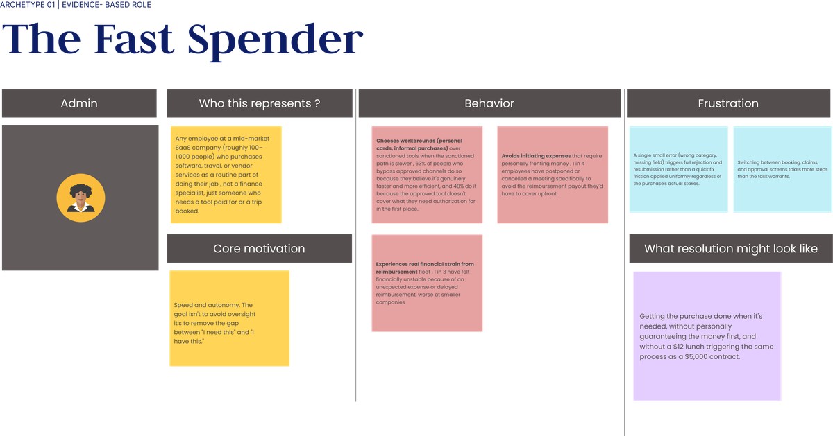
Employee-side reality: 63% bypass sanctioned tools because it's genuinely faster, not carelessness. 1 in 4 have postponed or cancelled a meeting to avoid fronting an expense. 1 in 3 have felt unstable due to reimbursement delay.
COMPETITIVE TEARDOWN
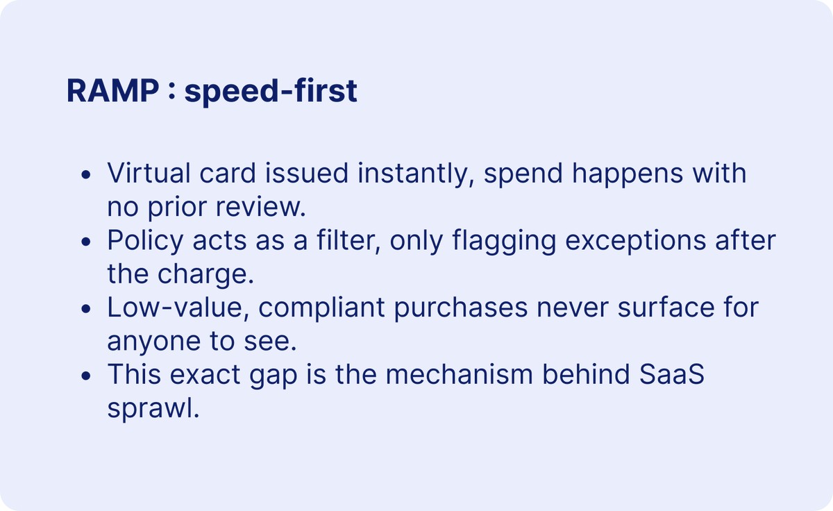
ARCHETYPE 01 | EVIDENCE-BASED ROLE
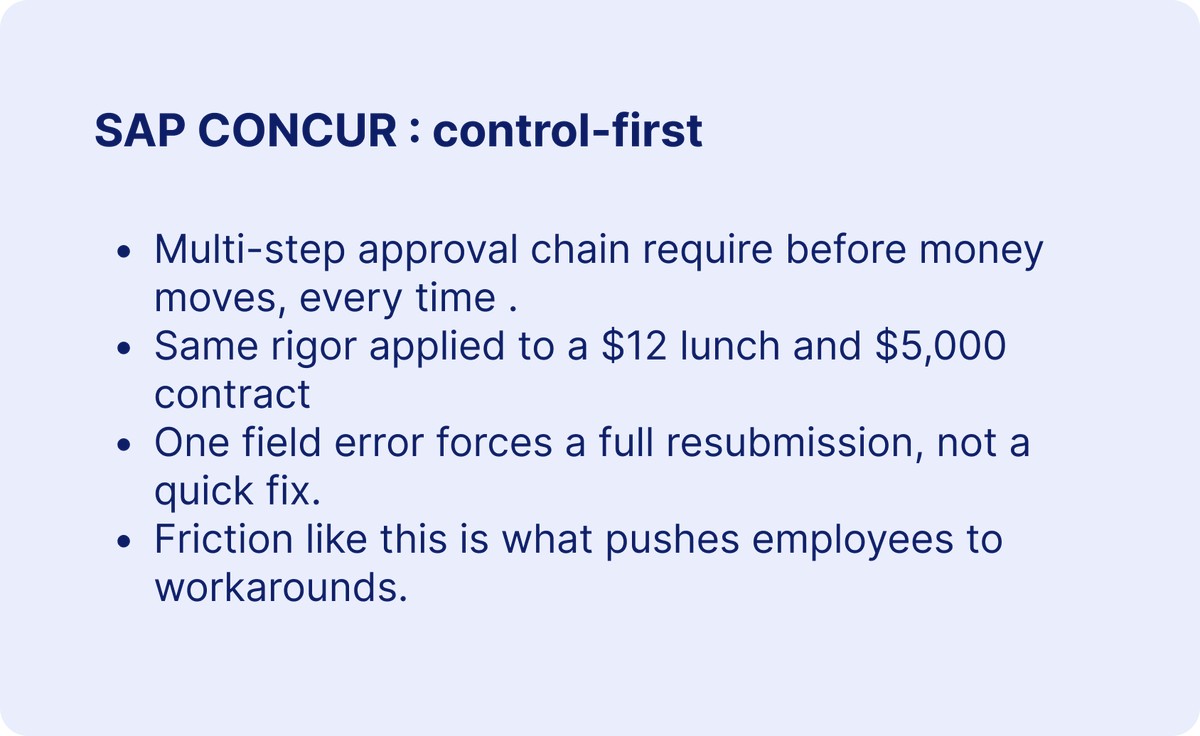
ARCHETYPE 02 | EVIDENCE-BASED ROLE
DESIGN PRINCIPLES
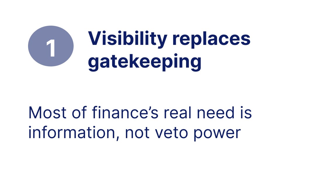
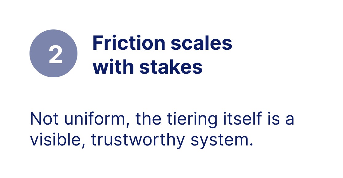
THE SOLUTION CONCEPT

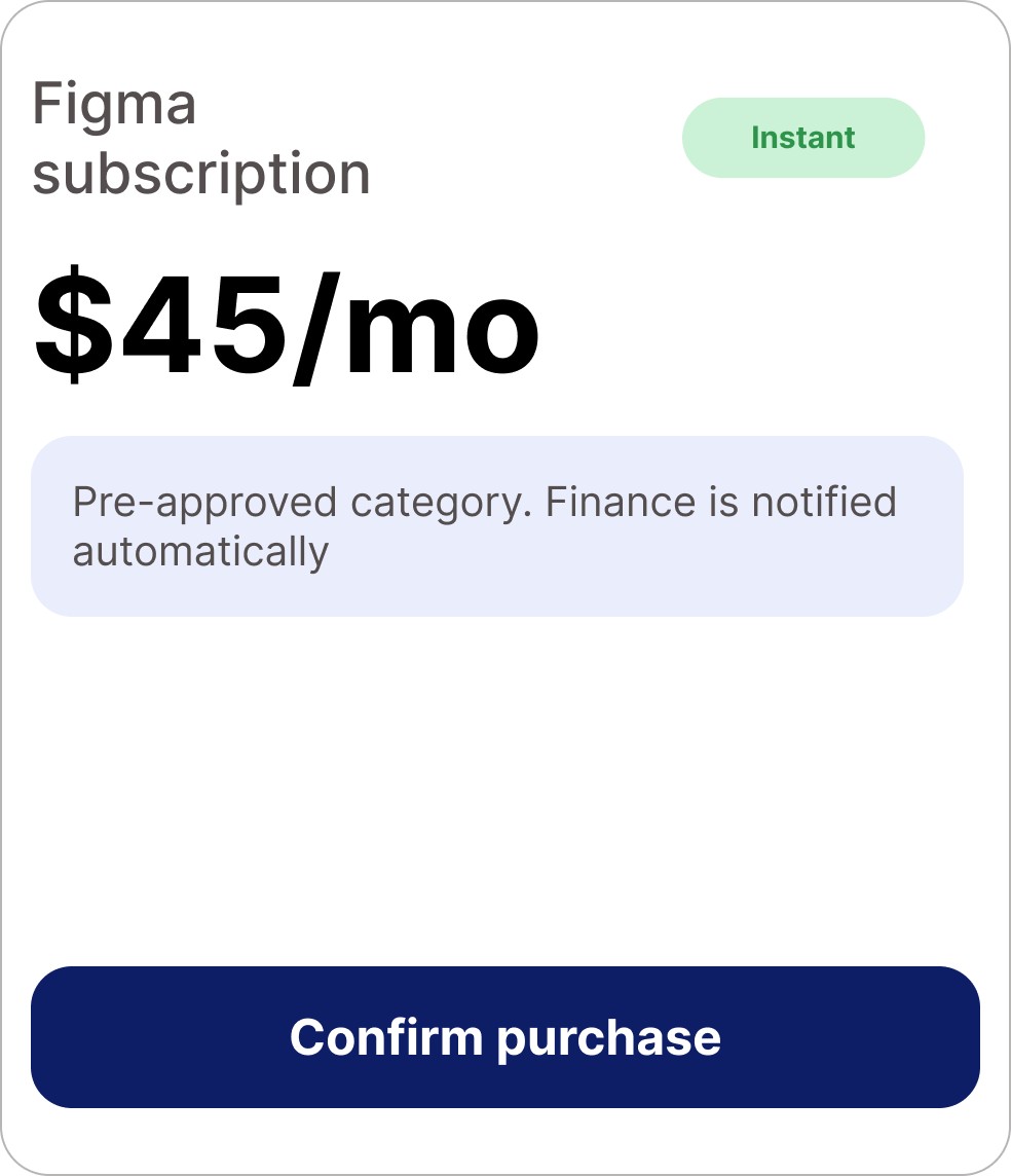
The mechanism: spend is tiered by stakes, at the moment of intent.
Moves at speed-first-tool pace, instant, pre-approved, finance notified automatically.
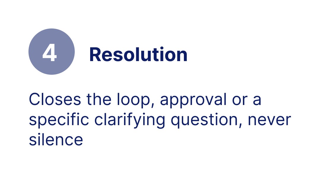
Gets a real, short intervention window, faster than a control-first chain, never a silent approval.
SCREEN 01
LOW-STAKES
OVER THRESHOLD
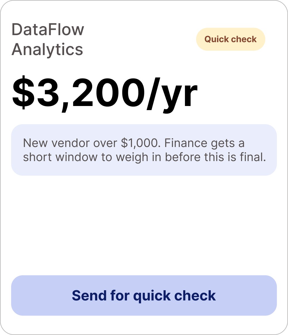
Why this works: Same interaction pattern for both tiers. The employee learns one tool, not two. Policy reasoning shows inline, before commit, not discovered as a rejection afterward. CTA language shifts ("send for quick check") to set expectation without feeling like a block.
SCREEN 02
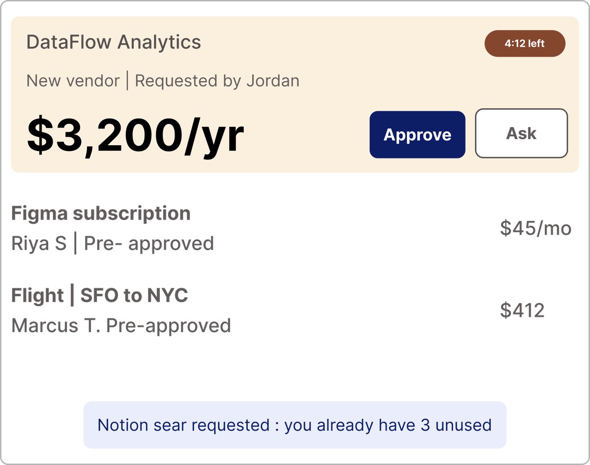
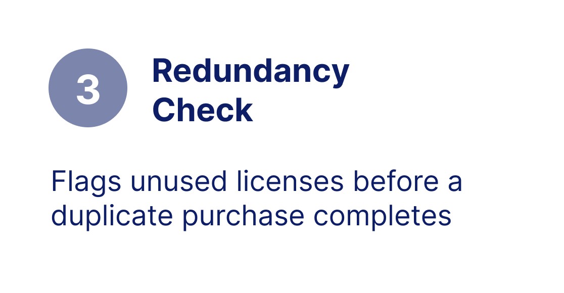
Why this works: The countdown is a bounded, real window, not a multi-day chain, not a single auto-approval. Auto-cleared items sit quietly below as ambient awareness, not a queue finance has to process. The duplicate-license nudge surfaces redundancy before it becomes another line in the sprawl stats.
THE DESIGN: SIX SCREENS
HOW WE'D KNOW IT WORKED
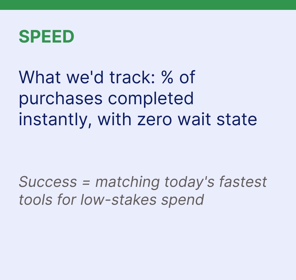
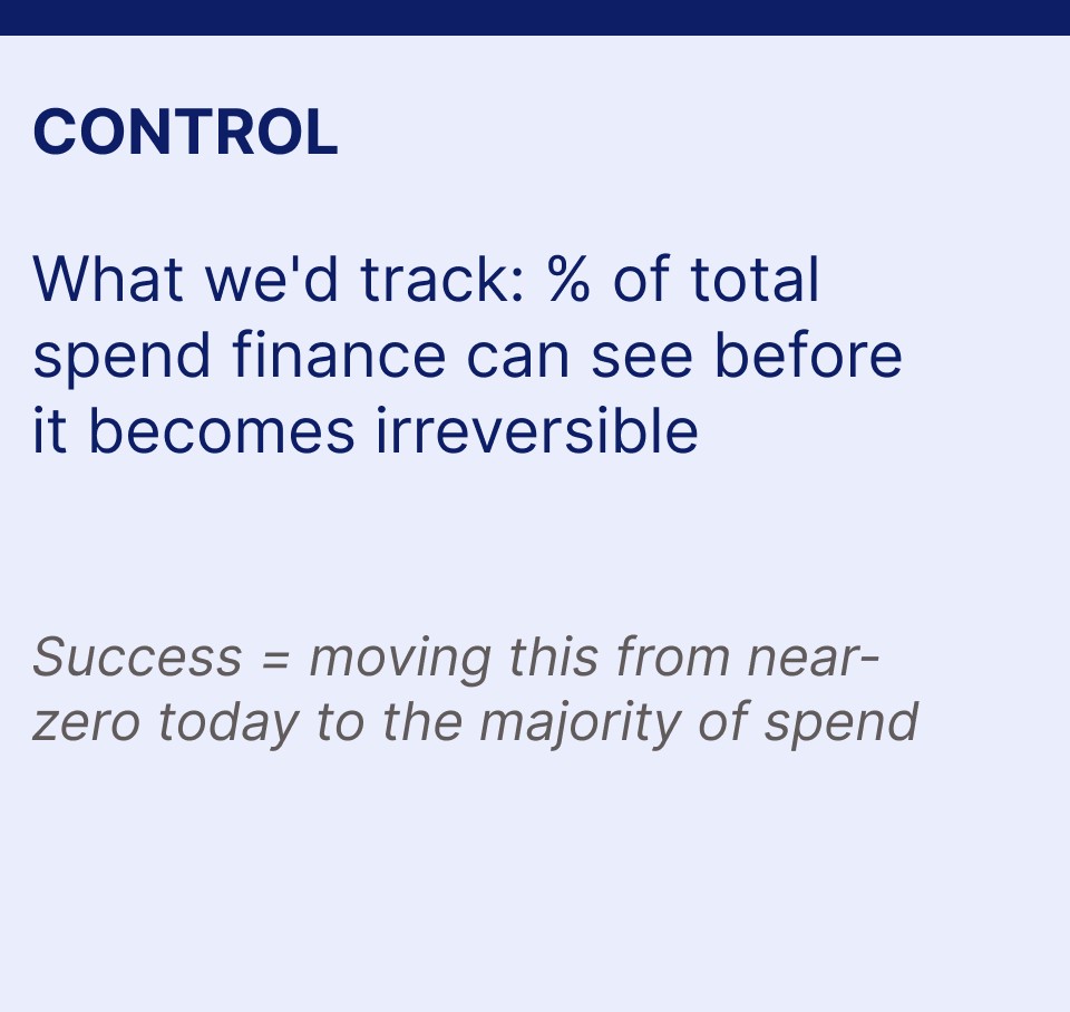
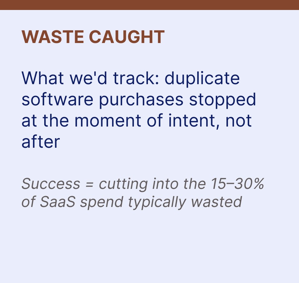
Speed and control aren't opposing forces, they're two outputs of the same missing thing; a shared moment where both people see what's happening at once.